Nebula Sans

Introducing
Nebula Sans
A versatile, modern, humanist sans-serif with a neutral aesthetic, designed for legibility in both digital and print applications.
Based on _Source Sans_ by Paul D. Hunt for Adobe Fonts.
Nebula Sans is the new brand typeface for Nebula, the premium streaming service from independent creators. Based on _Source Sans_ and designed to be a drop-in alternative to _Whitney SSm_, Nebula Sans is available for anyone to use under the SIL Open Font License.
 Watch our short documentary film about the story behind Nebula Sans, written & directed by David Friedman.
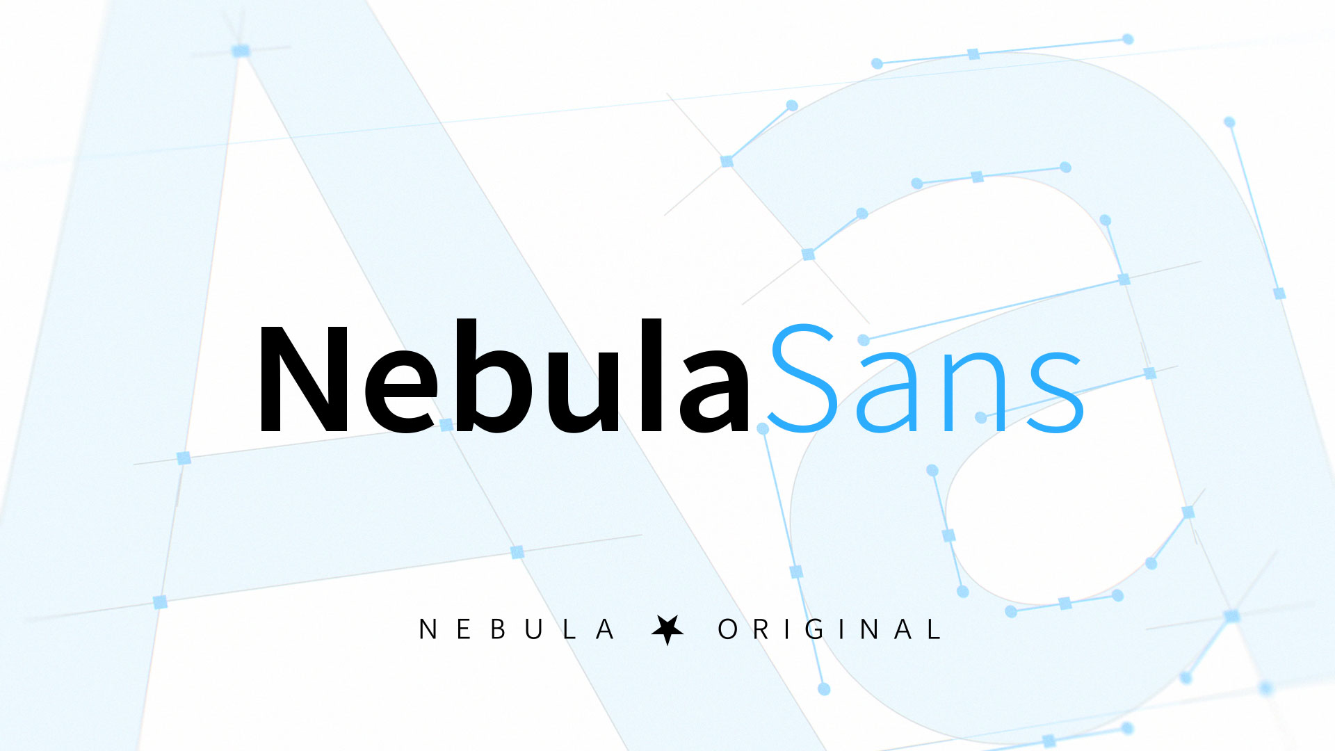
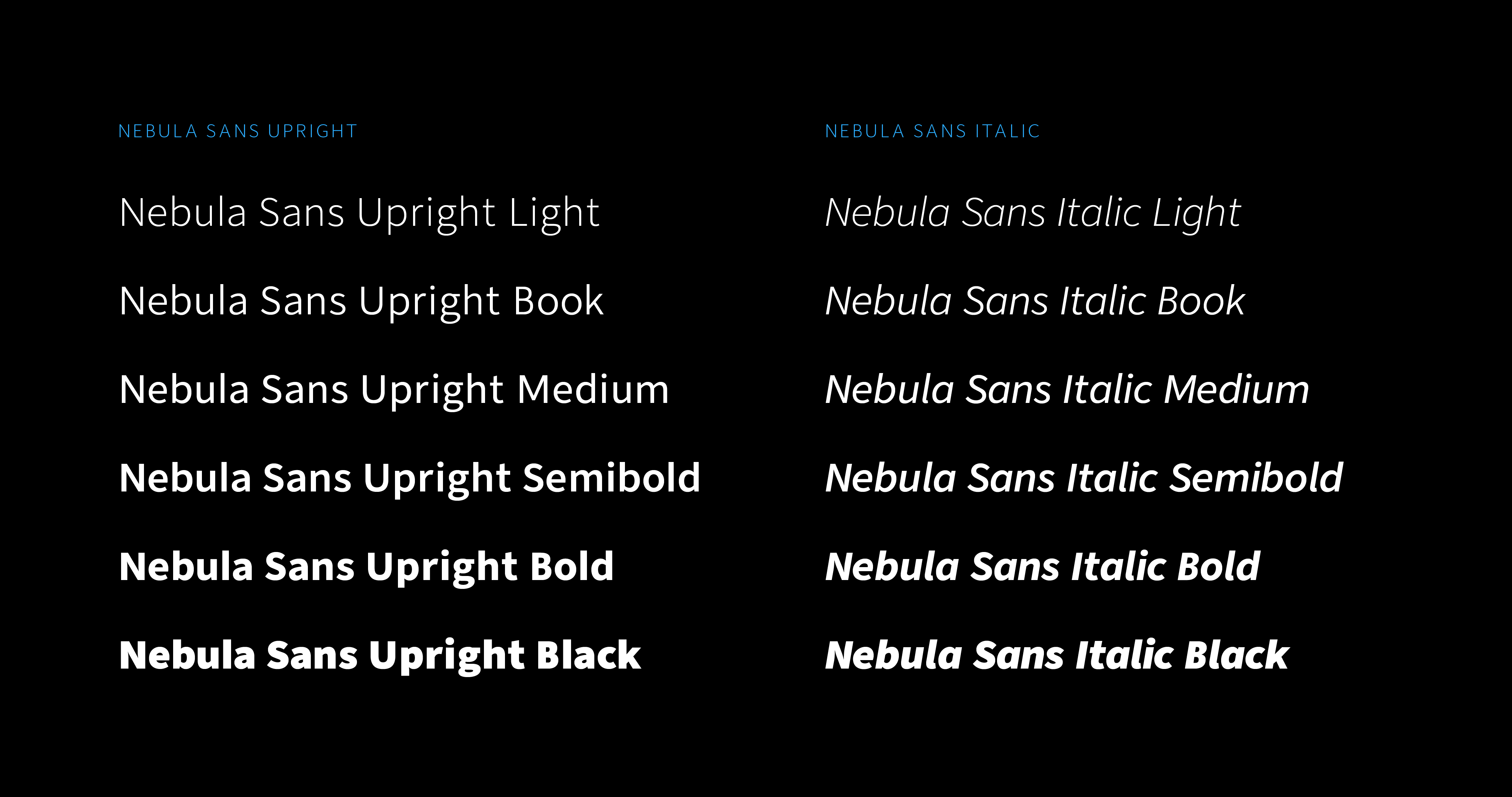
Featuring two styles in six weights, Nebula Sans is well-suited for use in interfaces, print, and for any other graphical, digital, physical, metaphysical, metaphorical, or allegorical typeface needs.
Nebula Sans Light
I’d take the awe of understanding over the awe of ignorance any day
Nebula Sans Book
The “tv” in nebula.tv stands for “Taylor’s Version”
Nebula Sans Medium
Don’t use seven words when four will do
Nebula Sans Semibold
Introducing: Facts and fiction
Nebula Sans Bold
An indie streaming service
Nebula Sans Black
Powered by humans
Nebula Sans Black Italic
Enter the Snack Zone
Nebula Sans Bold Italic
There’s no place like home
Nebula Sans Semibold Italic
Charl is the key to our success
Nebula Sans Medium Italic
We’re assembling a crew for a heist
Nebula Sans Book Italic
We believe in facts, science, and human rights
Nebula Sans Light Italic
I’ve been navigating based on cardinal directions…and vibes
Why we made this
We built our own typeface for a few key reasons:
1. **Personalization**: we can customize the fonts to align with our preferences. 2. **Features**: we can integrate advanced typography features tailored to our use cases. 3. **Sustainability**: the cost of licensing commercial typefaces increases as we grow.
Source Sans was the perfect foundation for Nebula Sans because it shares many primary characteristics with _Whitney SSm_, our previous brand typeface — both were designed to bridge the gap between American gothic and European humanist typefaces, with a strong emphasis on readability. The majority of the adjustments we made were to adapt the metrics of _Source Sans_ to better match those of _Whitney SSm_, since _Source Sans_ is smaller and narrower by default.
!Image 3: The word 'handgloves' in both fonts, overlayed on each other to show the differences.
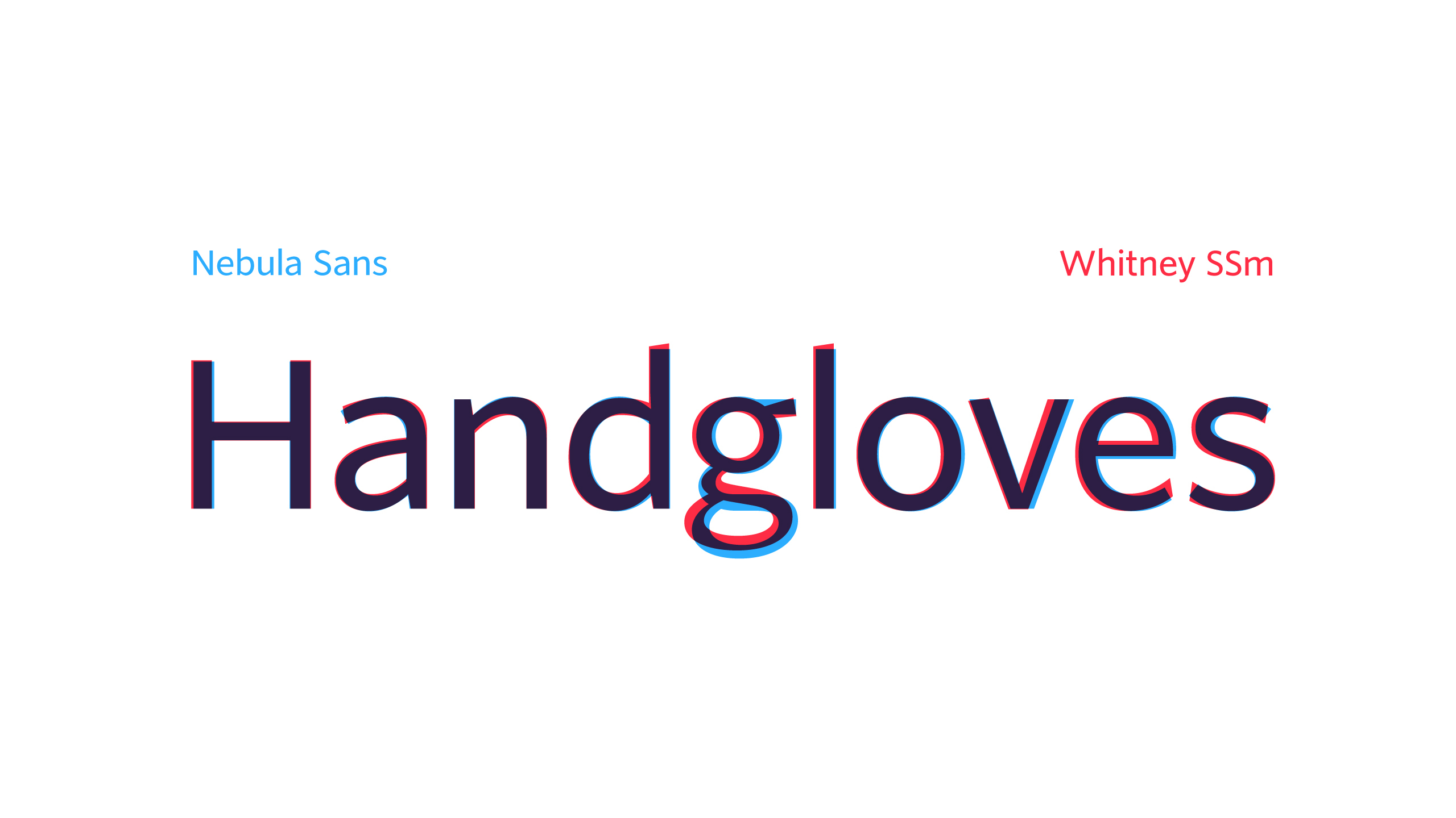
Comparison of Nebula Sans versus _Whitney SSm_
!Image 4: Nebual Sans upright and italic examples.!Image 5: Text about a literal nebula, showcasing the font's capital letters and numbers.!Image 6: Alternate glyphs for the letters 'A', 'L', and 'G'.
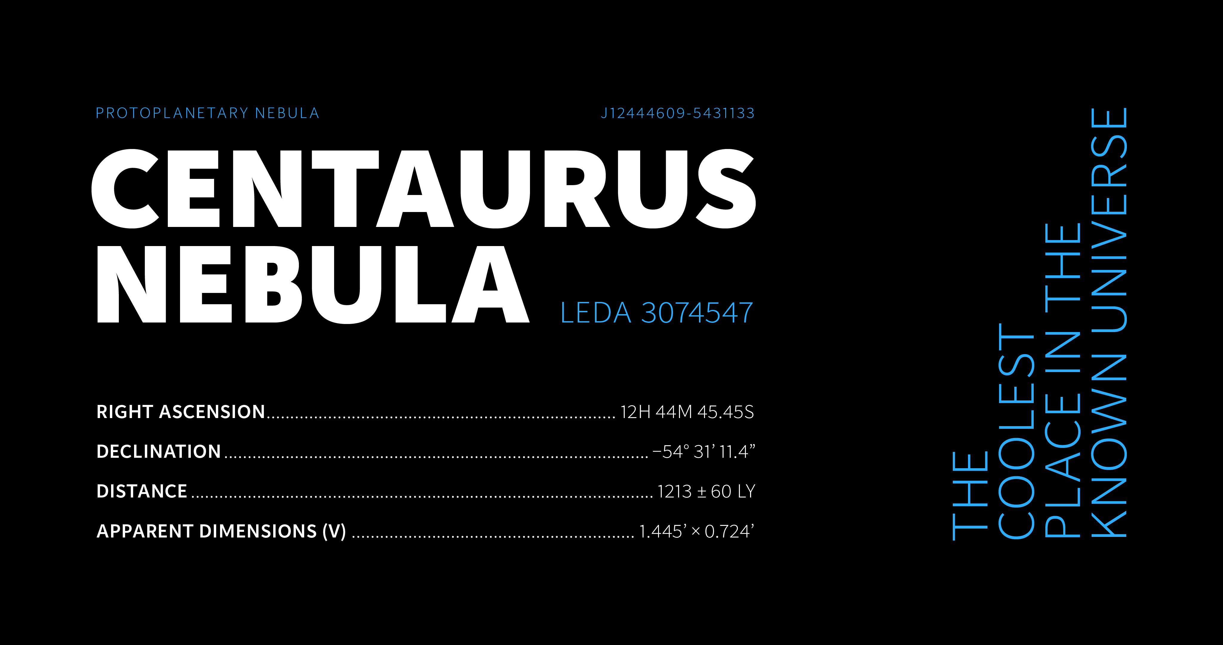
Typographical Details
Punctuation
The default punctuation marks in _Whitney SSm_ were, to our taste, too straight. Nebula Sans uses beautiful curly glyphs from _Source Sans_.
!Image 7: Curly, or smart, quotes.!Image 8: Comma and period.!Image 9: Colon and semicolon.!Image 10: At sign.!Image 11: Ampersand.!Image 12: Parentheses.
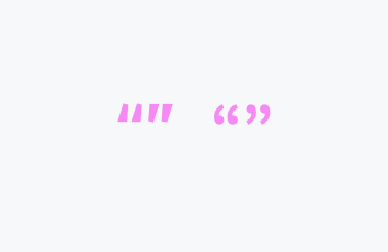
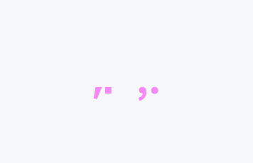
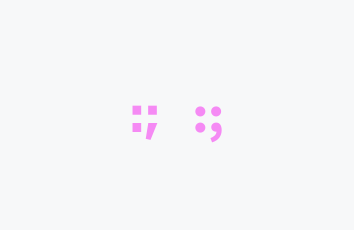
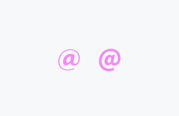
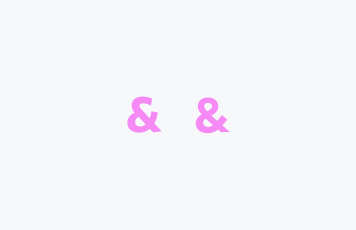
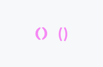
Whitney SSm vs Nebula Sans
Stylistic Alternates
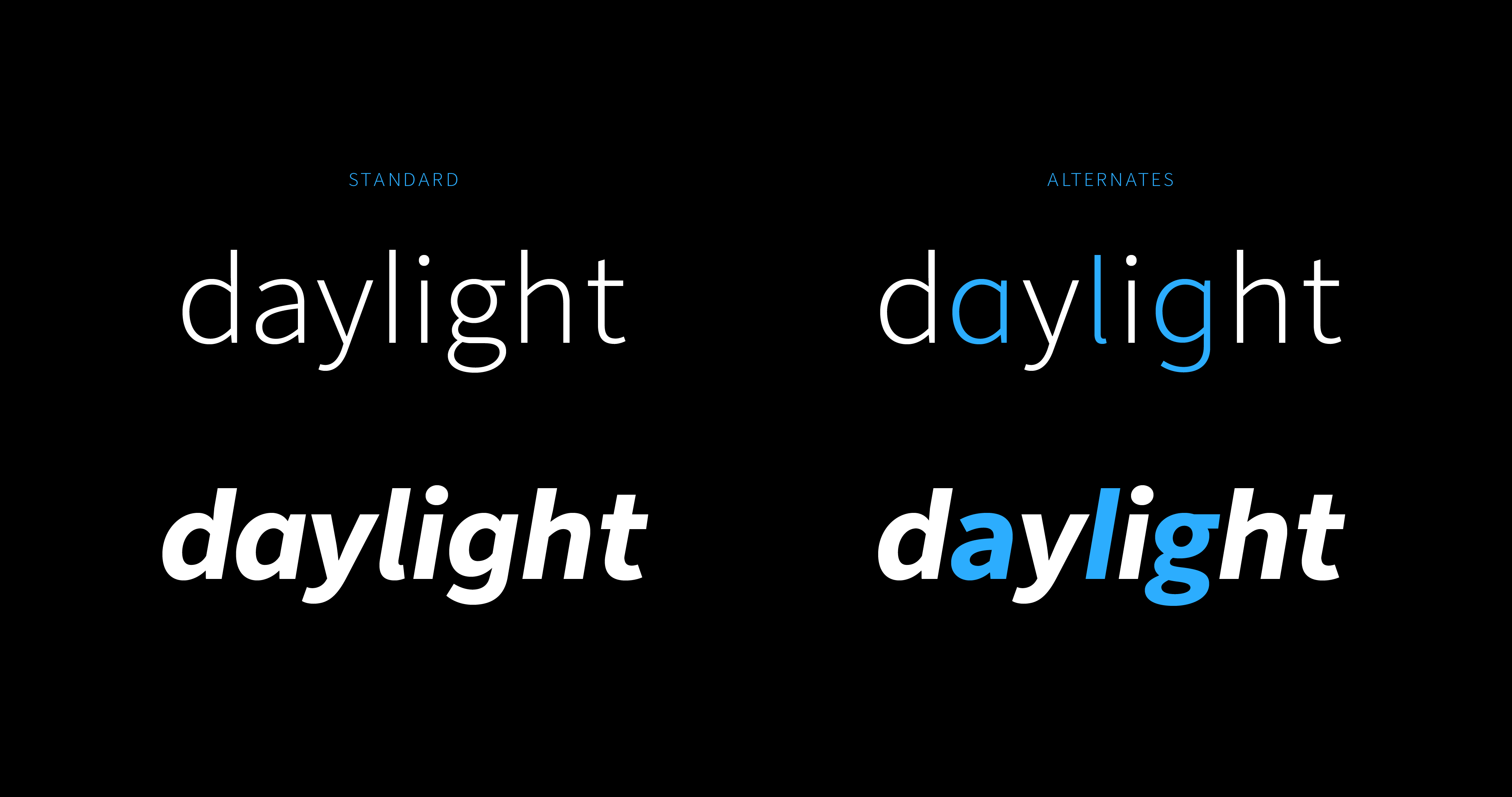
Nebula Sans features the same stylistic alternates as _Source Sans_, with the defaults aligned with those of _Whitney SSm_.
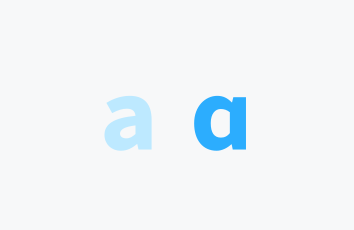
Single storey a font-feature-settings: 'ss01';
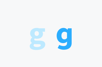
Open g font-feature-settings: 'ss02';
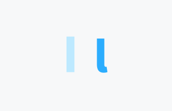
Tailed l font-feature-settings: 'ss03';
Asterisk
In typography, the asterisk symbol was named as such because it resembles a star. We love stars, so how could we not put our own spin on this little glyph?
!Image 16: An upside-down star.

Nebula logo
!Image 17: An upside-down five-pointed asterisk.

Nebula Sans asterisk
Tabular Figures
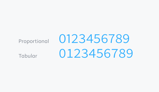
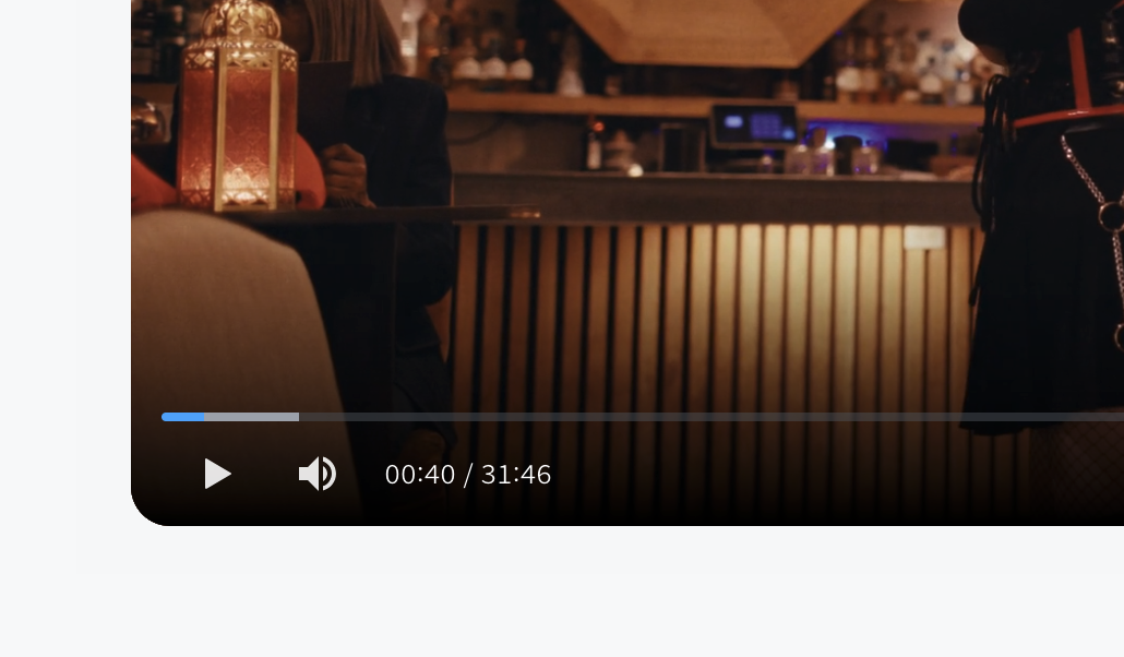
The default version of _Whitney SSm_ lacks support for tabular lining figures, so we were thrilled to be able to include them in Nebula Sans. Tabular figures (or monospaced numerals) allow us to do things like increment the timestamp in the video player while keeping the digits from jumping around as they change.
!Image 18: Proportional versus tabular figures. With tabular figures, every digit is the same width.!Image 19: The timestamp on a Nebula video player.
Wait now it’s working
Why did it not work _5 minutes ago_
Internet weather
Sent 2:57pm
@&%!$#?!*
Sent 3:06pm
Lorem ipsum dolor sit amet, consectetur adipiscing elit.